


Hey creative friends, you are about to get in a cool trip through my creative process now, full of descritive texts and cool images!
I hope you enjoy to know more how I have worked on this project from 2021: I tried to keep as much visual info as possible of all the process, so people interested can understand best my way of work and hopefully give me some great feedback and powerful insights as well!

This client got in touch with me telling that are setting up a sport climbing academy called [initially] Canyon, which will be located in São João da Boa Vista, Brasil. Their products, in addition to the gym, would be an on-site and online store where we would sell clothing, climbing and camping equipment.
Basically asking for the creation of a logo for this space: it would be applied to the front of the gym, on the climbing walls, their Website and App, where they will make reservations and give training tips, and which would also be used in Clothing Brand.
The initial idea is that it is something that relates sport, nature, but at the same time calm, which would be the feeling of reaching the top and being able to rest.
I will state the obvious here: they decided to change the name to Íbex, which I agree was a very interesting move.
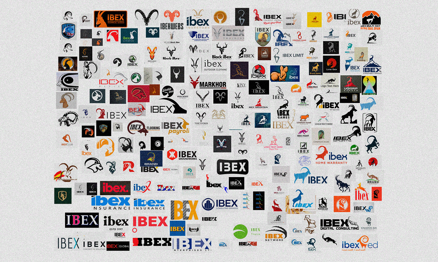
So the first thing I have done was a research of the most solutions I could find of Íbexes made before, due the simplicity of the naming, so I could avoid to repeat it or come up with a effortless-looking Logo.

With this visual research material I could think beyond the mostly used solutions to represent an Íbex, this is a useful way of get rid of the imediate ideas that may emerge. Also I would love to incorporate some climb aspect on the Íbex itself, so it looks more apropriate to their business.
Here you can see a shot of multiples sketches I have done on paper!
It was very nice to see all of them with some distance, at the wall!
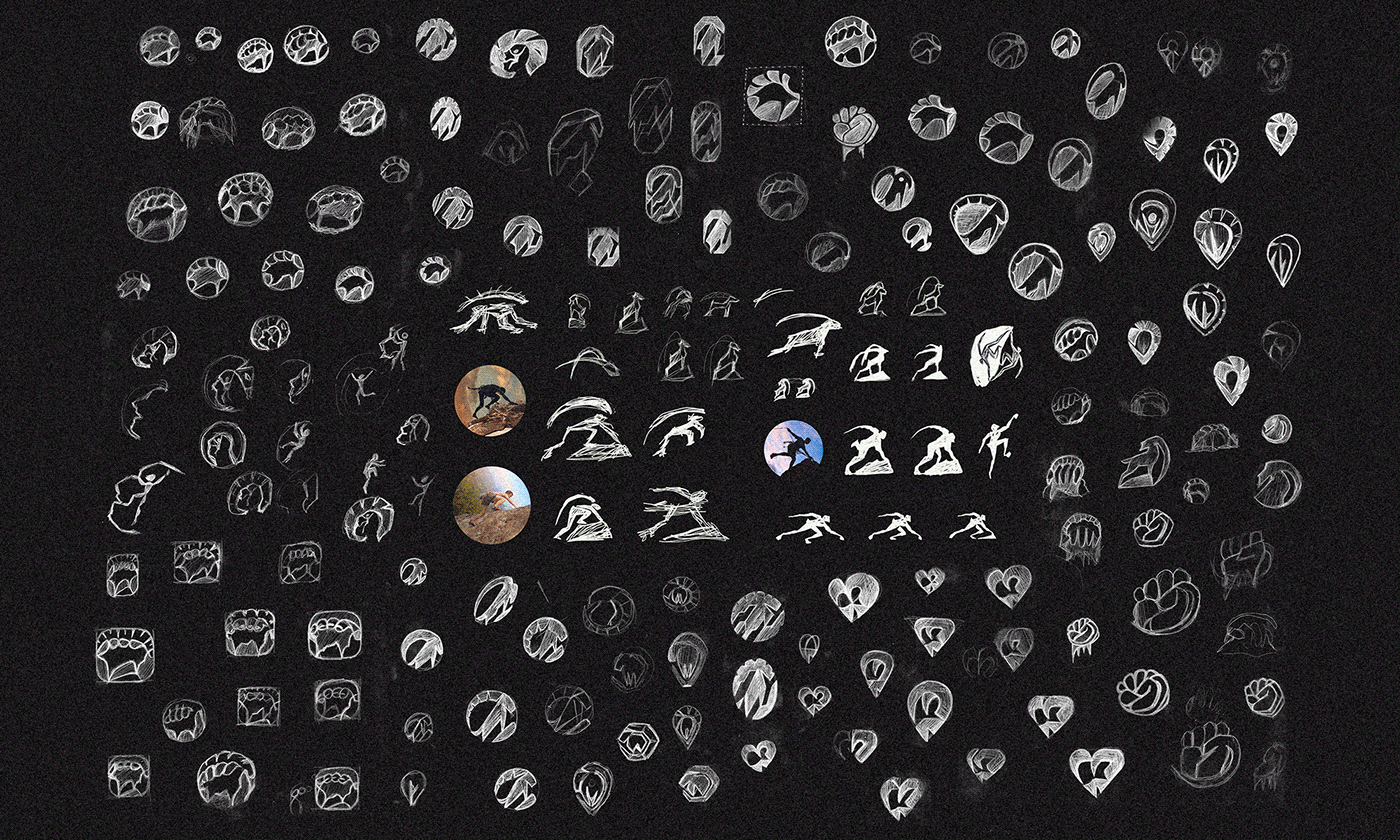
Some solutions are tough to get just using pencil and paper, so it is time to scan the best ones and clean a bit using Photoshop or something, also I have added some variations started on Ps [check the central ones close to the circular images].
Also I like to see the inverted effect of the sketches before start refining to get more idea of the weight of the shapes, IDK exactly how it helps to be honest, but it very helpful to me.

Client lovely plenty of the sketched ideas, we have pick the best ones.
We loved the technical aspect of those, kinf of suggesting a climbing gear, some type of hook and almost a location pin. Felt like we was in a good direction.
But still was interested on the simple Íbex silhouette, I kept the bottom ones as a reminder of this information for the later refinements and variations.

Some call and a lot of thinking drove us to these three different directions, of course one of the most important aspects of the Íbex is the horn; but also we would like to keep the imposing posture of the body without making it too complex or realistic.
At this point I decided to stop sketching and start playing with vectors on Illustrator.

This direction looks very interesting and cover all the client needs except that it was initially too edgy and was some concern about it, so you can see I trying to soften the initial one into these four stages till a very rounded one.

The second one was my favorite at first, but for some unknown reason I imagined it using some transparency or gradient and could not reach a satisfying solution in a solid shape yet, you can see one option with solid single shape tho.

The charm of this one was it circular overall shape, it is almost the oposite of the first one in this aspect, but still with some edges and does not feels too soft.
Of course you at this point already get what was the chosen one, but what was really interesting about this option is that the client loved the line/stroke style and would love to see this applied to the other as well.

I go for it, and tried to translate all options into this style. Always keeping in mind that it must be simple enough to work on all scales but still have the Íbex recognizable.
You can noticed that I have removed as much details as I could here, but still feeling that I could do it best.

I have made several variations with small and major differences, I think is very interesting to see those side by side to understand what is vital to the logo and what is unnecessary.
Specially hard to represent was the horn without details and the land blocks.

Finally I got the result that fullfiled my soul; not without the help of some gradient and gaps to suggest more depth in some details. From those three I knew we will have a winner since all client needs was covered and I was also very proud of this result.
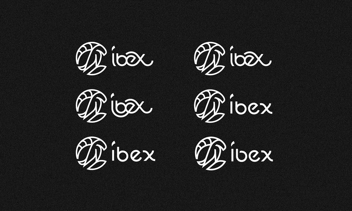
And here it is, the final concept was ready to receive a cool pairing type!
Its sort of funnt that I have found after all that process an initial sketch that looks pretty similar to it at the first round of sketches.
Also funny that we have some trouble to represent and choose the best tail for this Íbex, there was some concern and mixed feelings about the initial solution, so I have explored some different ideas till we reach the final-final one.
Here you can see the bezier wireframe of the chosen idea, It is very helpfull keep it not expanded, using the Illustrator Stroke feature I could figure out the best thickness and is easier to adjust minor details if needed.

I have started working on this type that I have made from scratch and noticed quite quickly that the little glyph above the I would be as tricky to do as it is to me for figure out its translation to English haha.
Make is similar to the horn shape seemed a smart solution to me, even tho it seems initially kind of a stress paired with the overall type.
I have explored many different and roundy, curly style of type, I loved the upper left options for instance, but the client was correctly concerned about readability, and I have to agree that it look a bit too much.

And after all those efforts, we finally got our final logo!
I can imagine how tiresome it must be to reach this point of our tour, so please if you reach this far please comment XEBI so I know you are a good friend :)

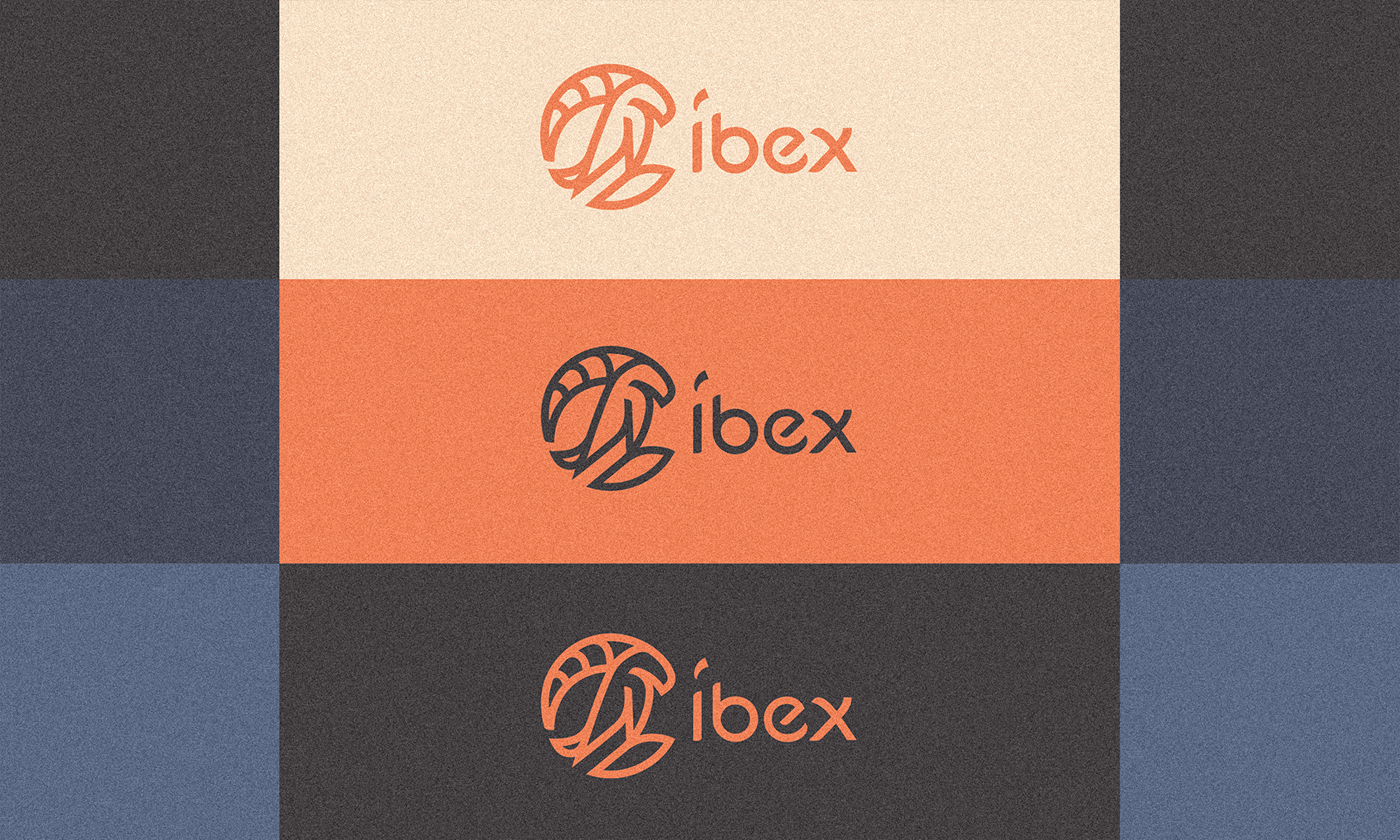
Well, but we are not done yet. I started to work with colors!
They need to be energetic and in some wat balanced in therms of warm and cold feel. So I decided to go with some earthy ones, oranges and blues.

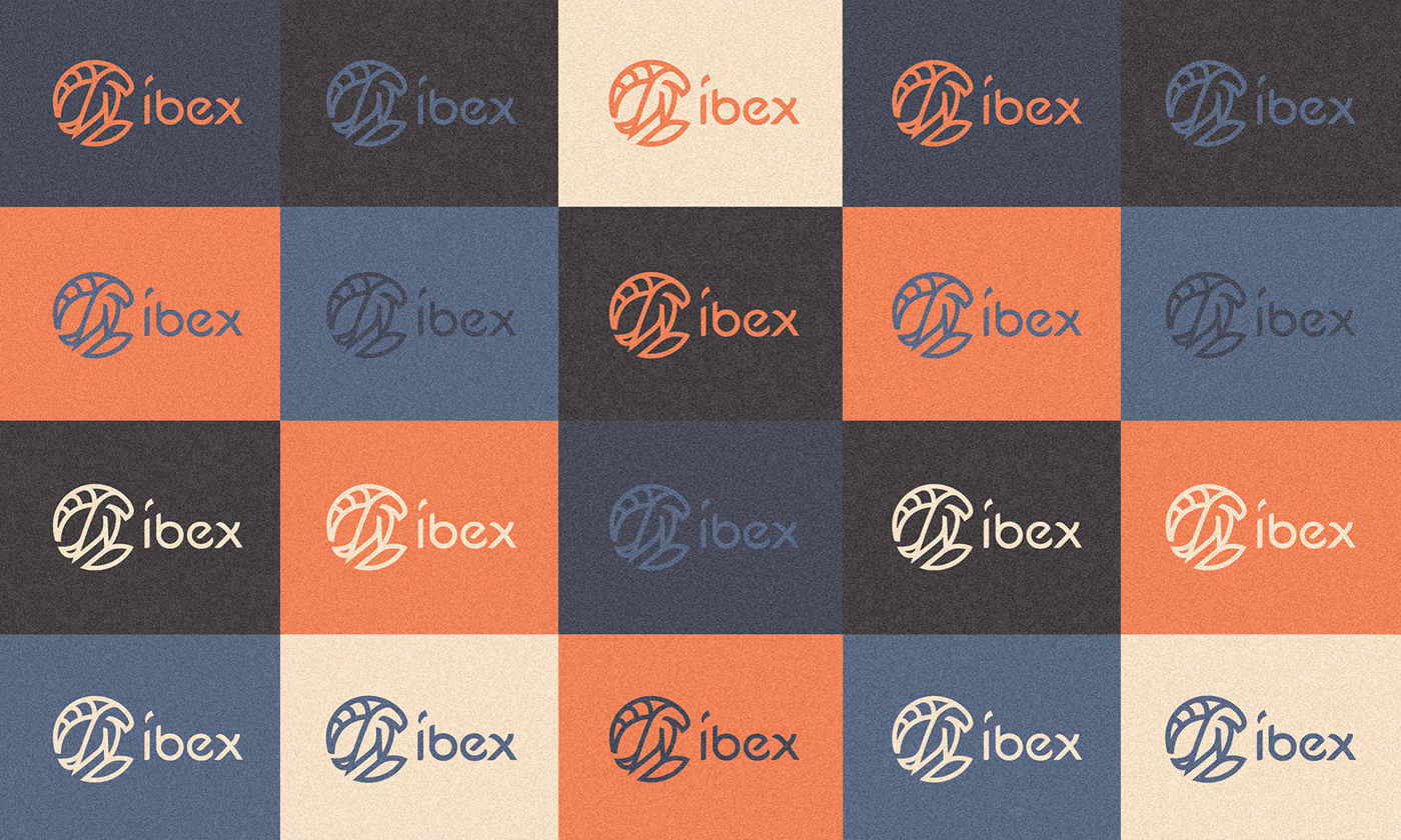
There was a need to have some wide range of color combinations to be used on the Clothing and products, so I experimented a lot!

Hopefully they print this pattern on some wall, would look really cool!

Some options have not the perfect contrast level I was looking for, so not all of them made it to the brandbook; but was amazing to experiment and see all side by side as a pattern.

This one was chosen as the official color combo. I love how ~solar it looks, I think it is warm and energetic, almost playfull and does not look too wild and edgy as a Íbex animal must be.

Those are the final colors in numbers, also some recommendations for the background colors use when needed. You can notice that I had some fun naming all the colors to give it some personality and landscape [if you know what I mean].

As I mentioned before, there are some blueish additional color combos...
...and orange, earthy ones; the main goal was to keep the balance between those two shade accents, I hope I managed to do it greatly!
These are the best ones IMHO, I also hope you are not tired of seeing the Íbex colors at this point, I know I have exceeded myself about it a bit but the reason is that I loved these palette!

Positive and Negative versions of the Íbex Logo have a slightly different thickness compensation so they can appears as the same weight. [gestalt issues]

I particularly loved how the symbol fit up the type in the Vertical version, was not intended just a grateful fortune I guess.

I have made some suggestion of pairing font too using a much similar to the type font as I can without risk the readability at small scales, I hope you can easily read a lot about the Íbex on the text above.

An Íbex is a robust animal and need some room to behave happly, so better respect this safety margin when applied!

I know it looks kind of busy at the scale, but I have done my best here to make all courves of the logo coherent to a perfect circular grid. There are also some distances and proportions to respect when drawing the logo by hand or something, I think this may be helpful.
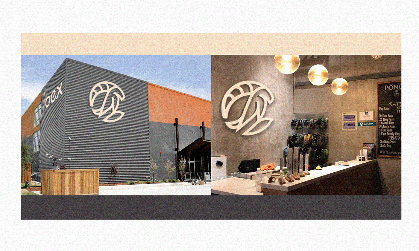
My Photoshop skills are not top notch, but this is how the Íbex façade and soiree would look like ideally; I hope I can see a photo of it soon, since I hear the building is already done and ready to be open soon!
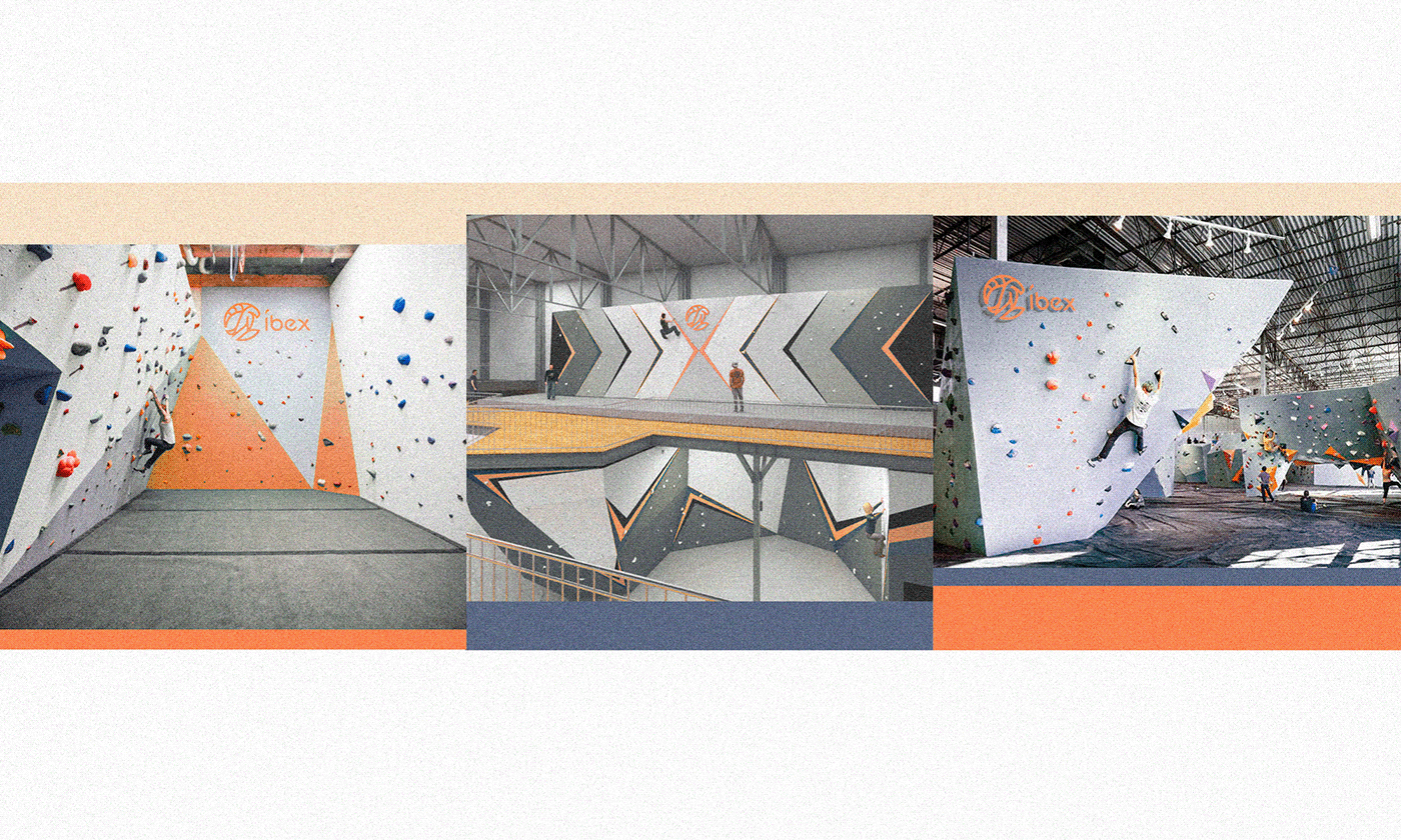
Some indoor sneak peeks, I would climb to reach that logo for sure!

As for Clothing here are my try on mockup it, I wish the client send me a couple of those, I would proudly use it! Not to climb tho, I am not that athletic or adventurous...

Well, thank you for reach the bottom of this page; I hope you enjoyed a lot the tour!
Do not forget to appreciate the project, this helps me a lot to get more interesting projects as a freelancer.
Do not forget to appreciate the project, this helps me a lot to get more interesting projects as a freelancer.
Feedback is much appreciated :)
I'm sure you have something nice to add!
Let me know your favorites and why, feedback is much appreciated!
Also I'm available NOW for new projects, so feel free for ask me!
Need a logo, illustration or other crazy stuff? Email me now :)
Follow & Connect, I am sure you will love to be tuned!


